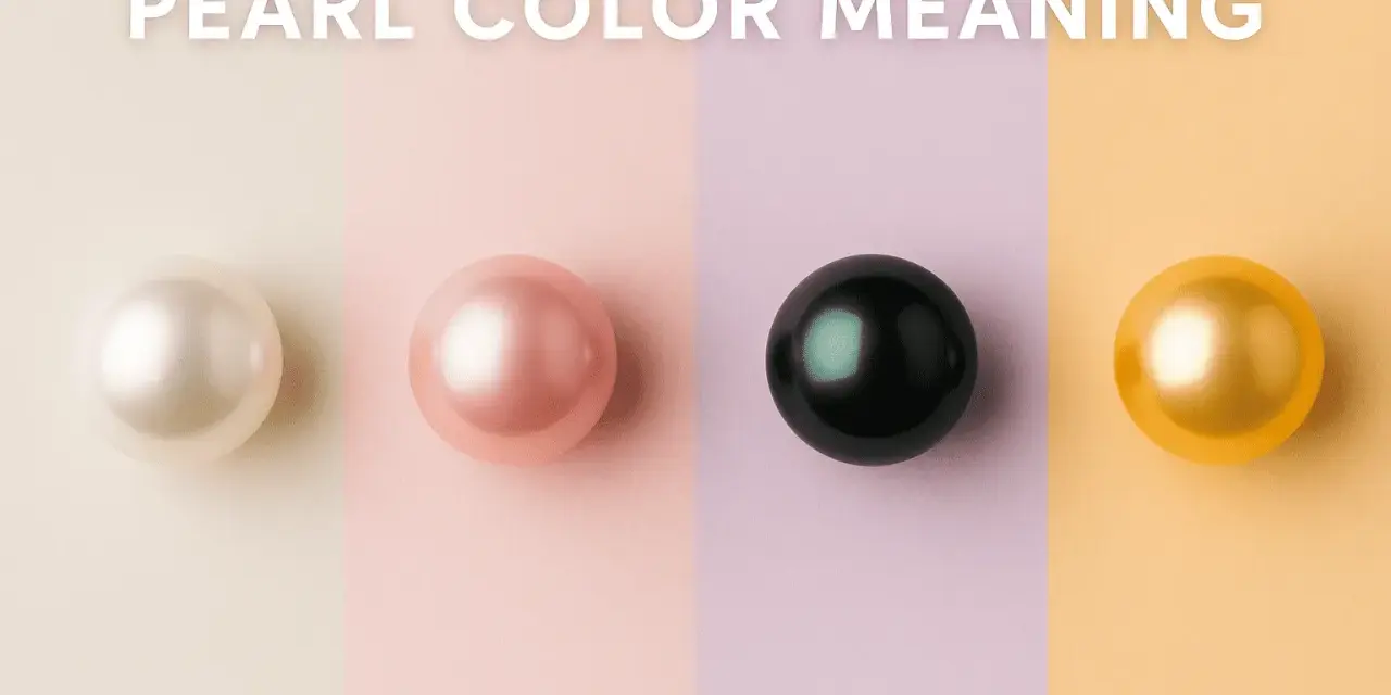
In pearls, colour is never just decoration. I read pearl color meaning as a blend of history, body colour, overtone and the mood the jewellery is meant to carry, which is why the same gem can feel bridal, formal or quietly rebellious depending on the shade. Here I break down the symbolism behind white, black, pink, gold and rarer green or blue pearls, then I show how to choose a colour that fits the wearer rather than a rigid rule.
The meaning of pearl colour shifts with shade, luster and context
- White and cream pearls usually signal purity, restraint and tradition.
- Black, grey and silver pearls read as stronger, more modern and more mysterious.
- Pink, peach and lavender pearls feel softer, more romantic and more personal.
- Gold, champagne and brown pearls lean into warmth, richness and confidence.
- Natural colour, overtone and treatment all affect how credible the symbolism feels.
What pearl colour is really telling you
Before I assign meaning, I separate the pearl’s body colour from its overtone and orient. As GIA explains it, body colour is the dominant shade, overtone is the translucent colour that sits over it, and orient is the iridescent flash that appears on or just below the surface. That matters because a pearl can look white at first glance and still carry a rose, silver or green sheen that changes the whole impression.
Historically, pearls have been linked with purity, wisdom, wealth and the sea, but the symbolic reading is never fixed. A pearl is noticed as much for its atmosphere as for its hue, so I tend to treat colour as a guide to tone rather than a hard translation. That is why one necklace can feel bridal in one setting and quietly defiant in another. The next step is to look at the classic shades and see how that tone shows up in practice.
White and cream pearls carry the most traditional meanings
White pearls are still the clearest symbol of purity, sincerity, innocence and new beginnings. In British bridal jewellery especially, they remain the safest choice when the brief is timeless rather than trend-led. I reach for white or cream pearls when I want the jewellery to feel polished without asking for attention.
Cream, ivory and soft rosé-white shades warm that message slightly. They feel less severe than a bright white and often sit more comfortably with yellow gold, cashmere and softer evening wear. The only trap is assuming white pearls are always the most versatile option; on a very minimal outfit they can look almost too expected, which is exactly when a darker or more coloured pearl starts to make sense. Once you move away from white, the mood changes fast, and black, grey and silver pearls make that very clear.
Black, grey and silver pearls shift the tone towards depth and authority
Black pearls usually read as mystery, independence, strength and a more assertive kind of elegance. I like them on people who want pearls to feel deliberate rather than delicate, because the darker surface creates contrast and gives the piece more presence. They are rarely shy, even when the design itself is simple.
Grey and silver pearls sit between classic and unconventional. They feel cooler, more architectural and slightly more modern than white, which makes them useful when you want polish with edge. A Tahitian pearl may bring deep charcoal, blue-green or peacock overtones, while some darker freshwater pearls can be enhanced, so I never read the symbolism without also checking the colour’s origin. From there, the softer colours show a different kind of symbolism.
Pink, peach and lavender pearls feel intimate and personal
Pink pearls usually read as affectionate, romantic and approachable, but I would not reduce them to sweetness alone. A pale blush pearl can suggest tenderness, while a richer pink or mauve tone can feel creative, expressive and a little more self-aware. That is why these shades work so well for gifts: they look personal without becoming sentimental.
Peach and apricot pearls add warmth, which makes them easier to wear with rose gold and softer neutrals. Lavender pearls are quieter and more unusual; I often read them as thoughtful, artistic and slightly introspective. Freshwater pearls are especially known for these gentle pastels, and the overtone can matter as much as the base colour itself. Those warmer tones lead naturally into the richer gold family.
Gold, champagne and brown pearls lean into warmth and status
Gold pearls are where symbolism turns more obviously luxurious. They usually suggest prosperity, confidence, success and warmth, and that is one reason they feel so strong in statement jewellery. In South Sea pearl pieces, the golden tone can look almost ceremonial, but in a good way: it reads as considered rather than flashy.
Champagne and light brown pearls feel more grounded. They still carry richness, yet they are easier to live with than a deep gold, which makes them appealing when someone wants warmth without a formal edge. I find these colours work particularly well in yellow gold because the metal and pearl reinforce each other instead of competing for attention. The more unusual green and blue pearls push the story into individuality rather than tradition.
Green, blue and peacock pearls stand out as rarer choices
Green and blue pearls are less about convention and more about personality. Green often reads as balance, growth and renewal, while blue leans towards calm, clarity and composure. If white pearls are the formal answer, these shades are the personal answer.Peacock pearls deserve their own mention because their appeal comes from more than one colour at once: you may see green, teal, violet and deep bronze moving across the surface. That layered effect makes them feel expressive and complex, which is why they are so good for someone who wants pearls with a bit of character. If a freshwater pearl looks unusually electric in green or blue, I would ask whether the colour is natural or treated, because very vivid tones are not always what they seem. That is where a simple decision framework helps more than a loose colour label.
How I choose the right colour for a gift or wardrobe
When I help someone choose a pearl, I start with the wearer’s habits, not the symbolic dictionary. A pearl that suits a navy suit, a silk dress or a cashmere knit will get worn; a pearl that only makes sense in theory usually ends up in a box. This is why I prefer a simple colour-to-use comparison instead of vague advice about what someone “should” wear.
| Situation | Colours that fit | Why I would pick them |
|---|---|---|
| Bridal or milestone jewellery | White, cream, soft pink | They feel traditional, calm and easy to pair with silver or gold. |
| Everyday polish | Cream, silver, champagne | They look refined without feeling too precious or formal. |
| Evening events | Black, gold, peacock | They create stronger contrast and a more memorable silhouette. |
| Romantic gifting | Pink, peach, white | They feel warm, thoughtful and easy to read emotionally. |
| Creative or fashion-led looks | Lavender, green, blue | They show individuality without needing a complicated design. |
My practical rule is simple: match the colour to the life the jewellery will actually live in. In the UK, that often means thinking about tailored outerwear, occasion dressing and the quieter, more layered wardrobes people wear most of the year. The last step is to check the details that can make the same colour read differently.
The small details that make the meaning more or less convincing
As GIA notes, pearls may be dyed, impregnated or coated, and that affects how I read the colour story. A treated pearl can still be beautiful, but I would not give it the same symbolic weight as a naturally coloured one if the whole appeal depends on the hue. If the colour looks unusually even, unusually bright or slightly neon, I want disclosure before I trust the meaning.
Luster also changes everything. A softly lustrous pearl feels gentler and more traditional, while a sharp, mirror-like glow makes the same shade look more contemporary and deliberate. Setting metal matters too: yellow gold warms the whole impression, while white metal cools it down. Once you factor in natural colour, overtone, luster and treatment, the symbolism becomes much more credible and much more useful.
Why the best pearl colour is the one that fits the wearer’s life
The most useful way to read pearl colour is to treat it as style language, not a fixed code. White speaks softly, black speaks with more authority, pink and peach feel intimate, gold looks confident, and green or blue tells a more individual story. None of those meanings is absolute; they only become convincing when they match the setting, the metal and the person wearing the piece.
If I had to give one final rule, it would be this: choose the shade that matches the wearer first, then check whether the pearl’s colour is naturally that colour and whether its overtone strengthens the message. That keeps the symbolism honest and the jewellery wearable, which is what matters most when a pearl is meant to be worn rather than just admired.