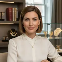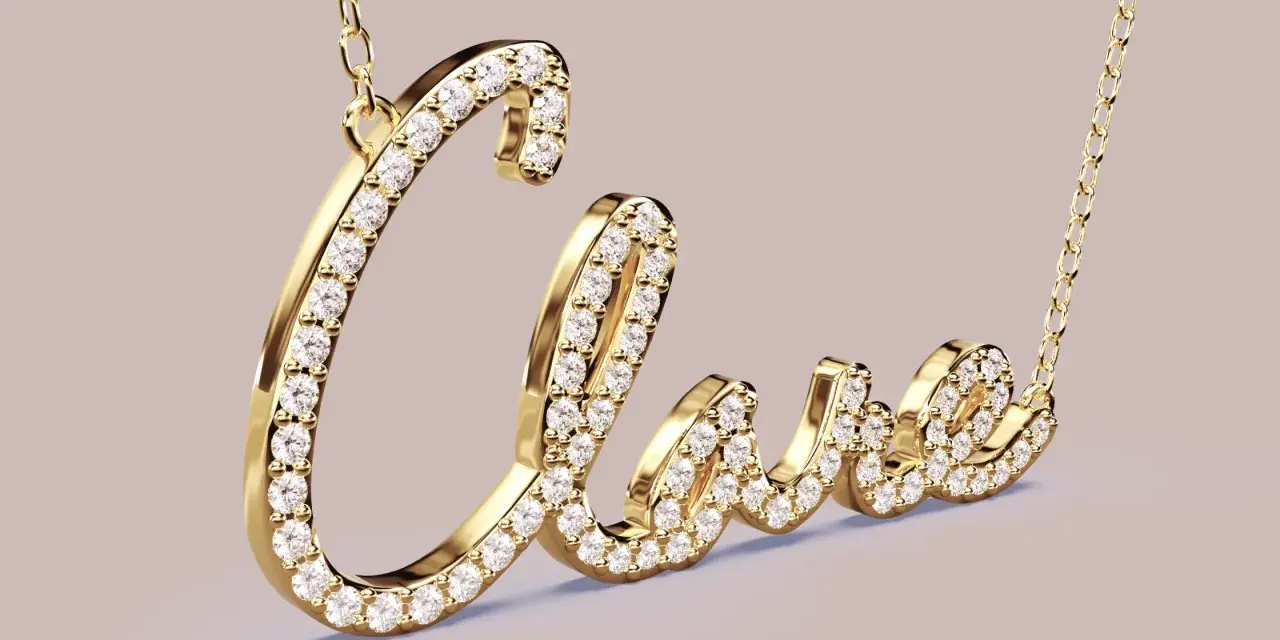
Initial necklaces sit in a strange place: sentimental enough to feel personal, simple enough to wear every day, and visible enough to be judged instantly. So, are initial necklaces tacky? Not when the design is balanced, the finish is good, and the styling feels intentional. In 2026, they are less about loud self-branding and more about whether a small personal detail can sit comfortably inside a cleaner, more polished jewellery look.
What really makes an initial necklace feel chic or cheap
- Scale matters more than the letter itself.
- Clean metals usually look sharper than overly glittery finishes.
- A simple chain and one pendant feel more current than crowded layers of charms.
- They work best when they complement the outfit instead of competing with it.
- In the UK, restrained styling usually reads as more elegant than novelty-driven design.
Why people call them tacky
I do not think the problem is the idea of an initial. The issue is usually execution. A necklace becomes tacky when it looks overworked, too shiny for the setting, or too obviously chosen to make a statement without any editing.
Most of the criticism comes from a few familiar mistakes:
- Oversized letters that feel closer to merch than jewellery.
- Very thin plating that dulls quickly and makes the piece look tired.
- Too much sparkle on a necklace that is meant to be worn casually.
- Fonts that are overly cute, swirly, or novelty-like.
- Pairing it with several other symbolic pieces, so nothing has room to breathe.
That is why the debate is so split. The necklace itself is rarely the real problem; the styling and finish are what decide whether it reads as personal or a little desperate. From here, the more useful question is not whether initial pendants are inherently bad, but which versions actually hold up.
Which versions actually look polished
There is a big gap between a delicate letter on a good chain and a loud monogram plate that tries too hard. If you want a piece that feels considered in the UK market, I would look first at proportion, then at material, then at how loudly it announces itself.
| Style | How it reads | Best for | When it can miss |
|---|---|---|---|
| Tiny initial on a fine chain | Quiet, clean, easy to wear | Everyday outfits, knitwear, shirts, minimalist wardrobes | Can disappear if the chain is too thin or the letter is too small |
| Mid-sized letter pendant | Balanced and visible without shouting | People who want the initial to be noticeable but not flashy | Can look dated if the font is ornate or the finish is too bright |
| Pavé or diamond initial | Dressier, more polished, slightly more glamorous | Evening wear, polished tailoring, gifts with a little sparkle | Can tip into twee if the stones are too small and too shiny together |
| Oversized monogram plate | Bold and fashion-led | Statement dressing, trend-driven looks, streetwear | Most likely to feel dated or loud if the rest of the outfit is already busy |
| Mixed-metal or sculpted letter | More modern and editorial | People who want something less predictable | Needs the rest of the jewellery to be equally intentional |
For me, the safest sweet spot is a small-to-medium initial in sterling silver, gold vermeil, or solid gold on a chain that sits neatly at the collarbone. That combination is much harder to make look cheap, and it still feels personal. Once the basic shape is right, styling becomes the real differentiator.
How I would style one in 2026
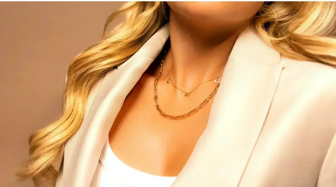
2026 jewellery is leaning toward cleaner statements, not clutter for the sake of it. That matters here, because an initial necklace tends to look best when it is treated as one deliberate focal point rather than one more thing in a pile.
Here is how I would wear one now:
- With a crew neck or fine knit, keep the chain short enough that the pendant sits close to the collarbone.
- With a V-neck or open shirt, let it sit slightly lower so it frames the neckline instead of fighting it.
- Choose one supporting piece, not five. Small hoops, huggies, or a single ring are usually enough.
- Match the metal to the mood of the outfit. Gold works beautifully with cream, camel, black, and warm neutrals; silver tends to feel sharper with white, denim, grey, and tailored basics.
- If you layer, keep the other chain thinner or simpler. A collar necklace or a very fine second chain can work, but two busy pendants will usually look untidy.
I also think British wardrobes make this easier than people assume. A simple initial pendant looks especially good against a white shirt, a black cashmere jumper, or a trench coat collar. Those clean backdrops give the jewellery room to read as intentional rather than decorative noise. The same logic helps when you compare it with other personalised pieces.
How it compares with other personalised jewellery
Sometimes the better question is not whether to wear an initial necklace, but whether another personalised piece would serve you better. I see these as different kinds of style signals rather than direct substitutes.
| Piece | What it says | Why you might choose it instead | Style risk |
|---|---|---|---|
| Initial necklace | Personal, simple, easy to recognise | Best if you want something subtle you can wear often | Can look generic if the design is too mass-market |
| Signet ring | Classic, quiet, slightly more polished | Better if you want a more grown-up, less literal personal piece | Less visible if you want the jewellery to be obvious |
| Engraved locket | Sentimental, heirloom-like, romantic | Best if the emotional value matters more than the trend value | Can feel old-fashioned if the design is too ornate |
| Nameplate necklace | Bolder, more fashion-forward, more explicit | Works if you want a stronger statement than a single letter | Higher chance of feeling dated or overly referential |
| Birthstone pendant | Personal but less literal | Good if you want colour and symbolism without using initials at all | Can look costume-like if the stone setting is cheap |
If I were advising someone in the UK who likes discreet jewellery, I would often point them toward a signet ring or a tiny initial before I would suggest a loud nameplate. The letter pendant sits in the middle: more obvious than a ring, less assertive than full-name jewellery. That middle ground is exactly why it can work so well, or go wrong so quickly.
The version I would actually buy this year
If I had to choose one version for everyday wear, I would keep it simple: a single initial, a fine but sturdy chain, and a finish that looks expensive even when the price is not. In practical terms, that usually means sterling silver, gold vermeil, or solid gold, not a plating that will fade after a few months of wear.
- Choose a chain length around 16 to 18 inches for most necklines.
- Keep the letter proportionate to the pendant space, not oversized for drama.
- Avoid extra crystals unless the rest of your style is already dressy.
- Pick a font that matches your wardrobe: clean and modern for tailoring, softer only if your style is already romantic.
- Wear it as a deliberate accent, not as filler among several louder pieces.
That is my honest answer to the question behind the search: initial necklaces are not tacky by default, but they are easy to cheapen. The versions that last are the ones with restraint, decent metalwork, and enough breathing room in the outfit to let the detail feel meaningful. If you keep the scale small and the styling clean, the piece stops looking like a trend and starts looking like a signature.