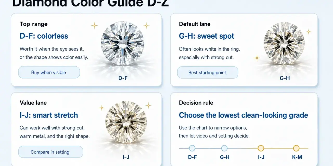
The diamond color scale is one of the simplest ways to judge how colourless a stone appears, but the practical meaning matters more than the letter itself. In this guide I explain how the grading system works, where the real differences show up once a diamond is set, and how to use the scale to choose a stone that looks right without paying for detail you will never see.
Key points to keep in mind before choosing a diamond
- D to Z measures the visible absence of colour, with D being the most colourless.
- Small grade differences can matter on paper, but cut, shape, and setting strongly affect what you actually see.
- G to J is often the practical sweet spot for buyers who want a bright look without paying the top premium.
- Step cuts such as emerald and asscher tend to reveal colour more easily than brilliant cuts.
- Diamonds beyond Z are graded differently as fancy colour diamonds, where stronger colour can increase value.
- A reliable grading report and a calm viewing environment matter more than showroom sparkle.
What the scale actually measures
At its core, the colour scale measures how much body colour a diamond shows, usually a hint of yellow or brown in the normal white-diamond range. The standard D-to-Z system used by GIA runs from D, which is colourless, through to Z, which shows light colour. Each letter is a narrow range, not a single fixed point, so two stones with the same grade can still look slightly different in real life.
That distinction matters because diamond grading is not just about lab labels; it is about perception under controlled conditions. Graders compare a stone against reference stones of known colour, under neutral lighting and precise viewing rules, so the result is repeatable rather than casual guesswork. The system was built to remove vague trade language and make diamond quality easier to compare across sellers and countries.
In practice, I find this is where many buyers first misread the system: they think the letter is the whole story, when it is really a starting point. Once that baseline is clear, the useful question becomes how those letters translate into actual appearance.
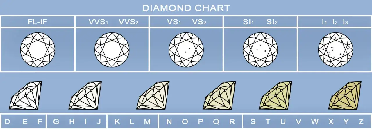
How to read the grades without getting lost in the letters
The easiest way to understand the scale is to group it into bands rather than obsess over each letter on its own. That is usually how I explain it to anyone comparing diamonds side by side, because the visual change is gradual. The higher up the scale you go, the less colour you see; the lower you go, the warmer the stone appears.
| Grade band | What it usually looks like | Best for | Practical note |
|---|---|---|---|
| D-F | Colourless or extremely close to it | Buyers who want the whitest possible appearance | Premium pricing is driven by rarity as much as visible difference |
| G-J | Near colourless | Most buyers looking for strong value and a bright face-up look | Often looks very white once set, especially in a well-cut stone |
| K-M | Faint warmth becomes easier to notice | Shoppers who accept a softer tone or want to prioritise other factors | Best viewed carefully in the exact setting you plan to use |
| N-R | Very light colour | Value-driven purchases or people who like a warmer look | Colour is more visible, especially in step cuts and larger stones |
| S-Z | Light colour with a clear tint | Budget-conscious buyers who are comfortable with visible warmth | Usually chosen for value, not to mimic colourless diamonds |
The table is useful, but I would still avoid treating the bands as hard visual walls. A well-cut G can look cleaner than a poorly cut F, and a small H can appear almost colourless once mounted. That is why the next thing I check is not the letter alone, but everything that changes how the letter appears.
Why cut, shape, and setting can change what you see
The colour grade is only one part of the visual result. A diamond’s cut controls how much light it returns to the eye, and strong brightness can mask a bit of warmth. That is why a lively stone often looks cleaner than a dull one, even when the paper grade is slightly lower.
Shape matters too. Round brilliants usually hide colour better than step cuts because their facet pattern is designed to return more light and break up body colour. Emerald and asscher cuts, by contrast, have larger open facets and a more architectural look, so they tend to reveal tint earlier. Cushion and radiant cuts sit somewhere in between, often offering enough brilliance to soften colour without fully hiding it.
The metal around the stone also changes the impression. White metal can make faint warmth more noticeable by contrast, while yellow or rose gold can make a lower colour grade feel more harmonious. Size matters as well: as carat weight increases, colour becomes easier to spot. I am usually more selective about colour once a stone gets larger, because the tint has more room to show itself.
One other factor people overlook is lighting. Shop lights can flatter a diamond; neutral daylight can be less forgiving. If you only judge a stone in one artificial light source, you are not seeing the full picture. That is why a sensible buying process matters as much as the grading language.
Where the value sweet spot usually sits
For many buyers, the best balance sits in the near-colourless range, especially G to J. These grades often look bright and refined once the diamond is mounted, but they usually cost less than D to F stones with very similar day-to-day appearance. That gap is where smart buying often lives.
If you want the cleanest possible look and budget is less of a concern, D to F is the obvious target. The reason people pay for those grades is partly aesthetic and partly about rarity. But in a real ring, especially one worn every day, the improvement over a top near-colourless stone can be very subtle unless you compare them side by side.
For shoppers who are trying to maximise carat, cut, or overall visual impact, K to M can be a workable compromise. I would only go there deliberately, and usually with a plan: a warmer metal, a cut that throws a lot of light, or a preference for a softer vintage mood. That range is not a mistake, but it is a design choice.
My rule of thumb is simple: pay for colour when you will actually see the difference. If the stone is small, brilliantly cut, and set in a way that suits its tone, you may not need to stretch into the top grades. If the diamond is larger or in a step cut, the higher grades start to earn their keep. That leads naturally to a different category entirely: diamonds that do not fit the white-diamond scale at all.
Fancy colour diamonds sit outside the scale
Once a diamond goes beyond Z, it is no longer judged on the same absence-of-colour scale. Instead, it becomes a fancy colour diamond, where grading focuses on the presence of colour rather than the lack of it. That includes stones with noticeable yellow, brown, pink, blue, green, and other hues.
This is one of the most important distinctions to understand, because the value logic flips. In the normal range, less colour is generally better. In fancy colour diamonds, stronger and more attractive saturation can be more valuable. A vivid pink or blue is not trying to be colourless; it is prized precisely because the colour is part of the appeal.
GIA grades those stones by hue, tone, and saturation, and the labels move into terms such as Fancy Light, Fancy, Fancy Intense, Fancy Vivid, Fancy Dark, and Fancy Deep. For a shopper, the lesson is straightforward: if you are looking at a yellow diamond that is clearly beyond the normal range, do not judge it by the same rules as a white diamond. Different category, different standards, different price logic.
That distinction saves people from one of the most common mistakes I see: assuming every coloured diamond is simply a lower-grade white diamond. It is not. The next question is how to verify the grade before you commit to a purchase.
How to check a colour grade before you buy
The most reliable starting point is a grading report from a respected lab, because a seller’s description is not enough on its own. A report gives you a shared reference point and lets you compare stones more honestly. Without it, you are mostly relying on someone else’s eye and lighting conditions, which is not where I would want to make a serious purchase.
- Ask to see the diamond loose, not only in a mounted setting, so you can judge body colour more clearly.
- Compare it in neutral light, not just under showroom spotlights that can flatter the stone.
- View it against a second stone of a known grade if you want to understand the difference in a practical way.
- Consider the final metal colour before deciding whether a slightly warmer grade will suit the design.
- Check the return policy before buying online, because colour can feel different once the stone is actually on your hand.
I also like to ask one blunt question: will the diamond still please me after the first hour, once the sparkle of the buying moment has faded? That is where a grading letter earns its keep. If the answer is yes, you are probably choosing for the right reasons rather than chasing the top row of the scale for its own sake.
What I would prioritise after the colour grade is clear
If I were choosing a diamond today, I would still place cut ahead of colour in most cases, because cut affects brightness, life, and overall presence more dramatically. Colour matters, but a well-cut stone in a sensible colour band usually looks better than a technically whiter stone that appears sleepy. That is especially true for everyday jewellery, where the diamond is seen in motion and in mixed lighting rather than under a grader’s lamp.
After cut, I would think about shape and setting, then about the colour grade itself. For a round brilliant in a white metal setting, a near-colourless stone often gives the most satisfying balance. For an emerald cut or a larger centre stone, I would examine the colour more carefully and be less casual about going down the scale. That is not a rigid formula, but it is a practical one.
Once you understand how the scale works, the letters stop being abstract and start becoming useful. The real goal is not to buy the highest grade on paper, but the diamond that looks right, suits the setting, and gives you the best mix of beauty and value. That is the point where the diamond colour scale becomes a tool rather than a sales label.