The essentials at a glance
- Cut quality is about how a diamond handles light, not just its outline.
- On round brilliants, the report grade reflects brightness, fire, scintillation, symmetry, polish and related design factors.
- A very strong cut often matters more to the eye than a small jump in colour or clarity.
- Fancy shapes need more visual checking because proportions are less uniform than in round stones.
- I would always compare stones in real lighting, not only by certificate grades.
What cut quality really measures
When people talk about cut, they often mean shape, but those are not the same thing. Shape is the outline you see from above; cut quality is about how the facets are arranged and finished so the stone returns light well. On a round brilliant, that relationship is especially important, which is why it has become the benchmark for sparkle-focused buying.
The practical question is simple: does the diamond look bright, lively and balanced when it moves? If light leaks out through the bottom instead of reflecting back to the eye, the stone can look dark or sleepy even if it has strong colour and clarity grades. I usually tell readers to think of cut quality as the difference between a diamond that feels “on” and one that only looks expensive on paper.
There is also a useful historical point here. Cut became central because cutters learned that well-chosen proportions could dramatically improve beauty without changing the rough stone itself. That is why a smaller well-cut diamond often looks more impressive than a larger one with weak light return. Once that distinction is clear, the next step is to see how the three main parts of finish and design work together.
How proportions, symmetry and polish shape the result
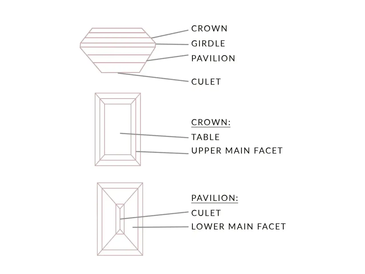
The three terms that matter most are proportions, symmetry and polish. Proportions describe the relationship between the table, crown angle and pavilion depth; symmetry describes how accurately the facets line up; polish describes how smooth the facet surfaces are after finishing. They sound technical, but they are really just different ways of asking whether the cutter has done precise work.
Proportions
Proportions control how light behaves once it enters the stone. If the table is too large, the crown too shallow or the pavilion too deep, the diamond may lose brightness or create dark areas. A good cutter is not chasing one magic formula, though. Different proportion sets can still produce attractive diamonds, which is why the best report grades are ranges rather than a single perfect recipe.
Symmetry
Symmetry is about consistency. Facets should meet where they are meant to meet, and the pattern should look orderly when you inspect it face-up. Minor symmetry differences are often subtle, especially to the naked eye, but they do affect the overall harmony of the stone. In practical terms, strong symmetry usually helps a diamond look crisp and intentional rather than messy.
Read Also: Diamond Cut Explained - Why It Shapes Sparkle & Value
Polish
Polish is the finishing work that leaves the facets smooth and reflective. Poor polish can create tiny surface marks that interfere with light performance, while excellent polish gives the stone a cleaner, sharper look. The difference between excellent and very good polish is often less dramatic than shoppers expect, but I still treat it as part of the whole, not a box to tick.
Put together, these three factors decide whether a diamond has that sharp, clean visual rhythm people respond to instinctively. With that in mind, it becomes much easier to read the grade on a report without overpaying for a label that sounds better than it looks.
What the grades on a report really tell you
For standard round brilliants in the common grading range, the overall cut grade usually runs from Excellent to Poor. That scale is useful, but it is not a promise that every stone within one grade will look identical. It is better to think of each grade as a band of appearances rather than a single exact result.
| Grade | What it usually means visually | My practical view |
|---|---|---|
| Excellent | Strong brightness, balanced scintillation and the best chance of a lively face-up look | My first stop for a round brilliant when sparkle matters most |
| Very Good | Still strong and often close to Excellent in normal viewing | Often the best value if the price gap to Excellent is large |
| Good | Can still be attractive, but light return is less consistent | Worth considering only if you are consciously trading some brightness for budget or size |
| Fair | Noticeable compromise in life and sparkle | Usually not where I would start |
| Poor | Weak light return and a duller face-up appearance | I would normally avoid it |
One detail that shoppers often miss is that a high overall cut grade can still allow small differences in symmetry or polish. Those finish differences are frequently subtle and may only be obvious under magnification. That is why I do not treat every top-grade stone as automatically worth a premium; I look at the actual face-up look and the price gap, then decide whether the extra money buys a visible improvement or just a neater report.
This is also where the shape of the diamond starts to matter more than people expect. A round brilliant has the most standardised cut framework, while other shapes need a more visual, case-by-case read. That leads naturally to the next question: which shapes reward a stricter eye, and which ones are more forgiving?
How to choose the right stone for the shape you actually want
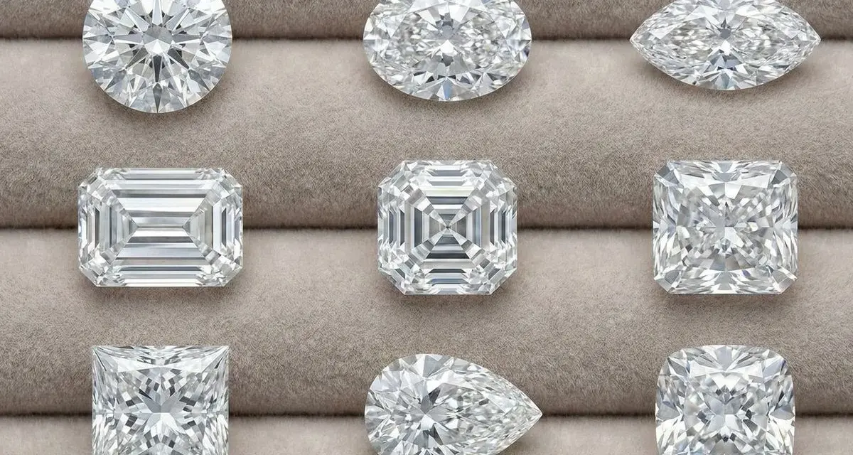
The round brilliant is still the safest choice if your priority is sparkle. It is designed to return light efficiently, and its cut grade is the easiest to compare on paper. If you want a classic, bright look with the least guesswork, this is where I would usually begin.
Fancy shapes can be beautiful, but they ask more of the buyer. Their outlines are less uniform, and the relationship between proportion and appearance is more shape-dependent. Here is how I think about the main families:
| Shape family | What to check first | Why it matters |
|---|---|---|
| Round brilliant | Overall cut grade, brightness and pattern | This shape is built for light return, so small differences in cut quality are easier to compare |
| Oval, pear and marquise | Outline symmetry, bow-tie effect and end points | These stones can show a dark band across the centre if proportions are off |
| Cushion and radiant | Facet pattern and edge balance | These shapes can look either soft and romantic or busy and uneven, depending on the cut |
| Emerald and Asscher | Step alignment, clarity and broad flashes | They trade some sparkle for a cleaner, architectural look |
| Princess | Corner protection and centre brightness | A sharp, lively princess should not look dark in the middle or fragile at the corners |
If you are buying in the UK, I would also pay attention to visible size in millimetres rather than carat weight alone. Two diamonds can weigh the same and still face up very differently if one carries too much depth. That is one of the quietest ways buyers overspend, and it is exactly why the next section matters: the mistakes that most often hide behind a neat certificate.
The mistakes that quietly cost money
I see the same buying errors again and again, and most of them come from assuming that the certificate tells the full story. It does not. The report is a tool, not a substitute for looking at the diamond properly.
- Chasing the highest grade without checking the price gap. A jump from Very Good to Excellent is not always visible enough to justify a large premium.
- Confusing size with presence. A deeper stone can weigh more while looking smaller face-up.
- Ignoring the shape’s weak points. Bow-tie effect, crooked outlines and uneven ends can spoil an otherwise nice stone.
- Judging only under one light source. Shop lighting can flatter almost anything; daylight and movement tell you more.
- Trusting photos without context. Static images do not show how a diamond behaves when it tilts or when light changes.
There is a simpler rule beneath all of this: if the diamond only looks impressive in a carefully controlled display, I would be cautious. The next step is to turn that caution into a straightforward buying checklist.
What I would check before buying in the UK
My preference is to make the decision in layers. First I want the report, then I want the stone in motion, and only after that do I let the setting and price finish the story. That sequence keeps the purchase practical rather than emotional.
- Ask for a recognised grading report and confirm that the stone’s measurements are clearly listed.
- For a round brilliant, start with Excellent or Very Good cut before looking at anything else.
- Compare the diamond in daylight, warm indoor light and direct spot lighting if possible.
- Look at the stone from the top, side and slight angle to judge brightness and pattern.
- Check whether the shape has a bow-tie, a weak centre or corners that seem too exposed.
- Compare face-up size in millimetres, not only carat weight.
- Make sure the setting will not hide the stone’s best angles or make it appear smaller than it is.
If I were buying for myself, I would prioritise a lively stone with clean proportions and a good face-up spread, then choose colour and clarity only as far as they support that look. That is usually the most honest balance between beauty, value and everyday wear. A strong cut does more than improve sparkle; it makes the whole diamond feel better resolved, which is exactly what you want from a piece that should still look elegant years from now.