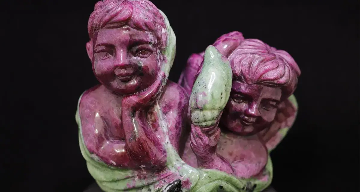
ruby in zoisite is one of those stones that makes sense the moment you see it: red ruby crystals set in a green zoisite matrix, sometimes with dark streaks that add even more contrast. In this guide, I look at what the material actually is, how to judge its appearance, where it works best in jewellery, and how to care for it without damaging the finish. That matters because this is a stone people often fall in love with visually before they understand how it behaves.
What matters most before you buy or wear it
- It is a rock made of more than one mineral, not a single gemstone crystal.
- The best pieces show clear contrast between the ruby, the green zoisite, and any dark amphibole.
- It is usually better for pendants, earrings, and carvings than for daily-wear rings.
- Most value comes from colour balance, polish, and craftsmanship rather than pure rarity.
- Gentle cleaning is safest: warm water, mild soap, a soft cloth, and no rough handling.
What this stone actually is
Geologically, this is a metamorphic aggregate rather than a single mineral species. The red parts are ruby, which is the gem variety of corundum, while the green body is zoisite; the darker streaks people often notice are usually amphibole minerals. That mix is exactly why the stone feels so lively in jewellery: it is built on contrast, not uniformity.
You will often see it sold under the name anyolite, especially in trade and collector contexts. The material is strongly associated with Tanzania, where the best-known occurrences were found near Longido, and that origin is part of its appeal for many buyers. I always think it helps to know this before judging a piece, because once you understand that it is a natural composite, the uneven colour and texture stop looking like flaws and start looking like the point.
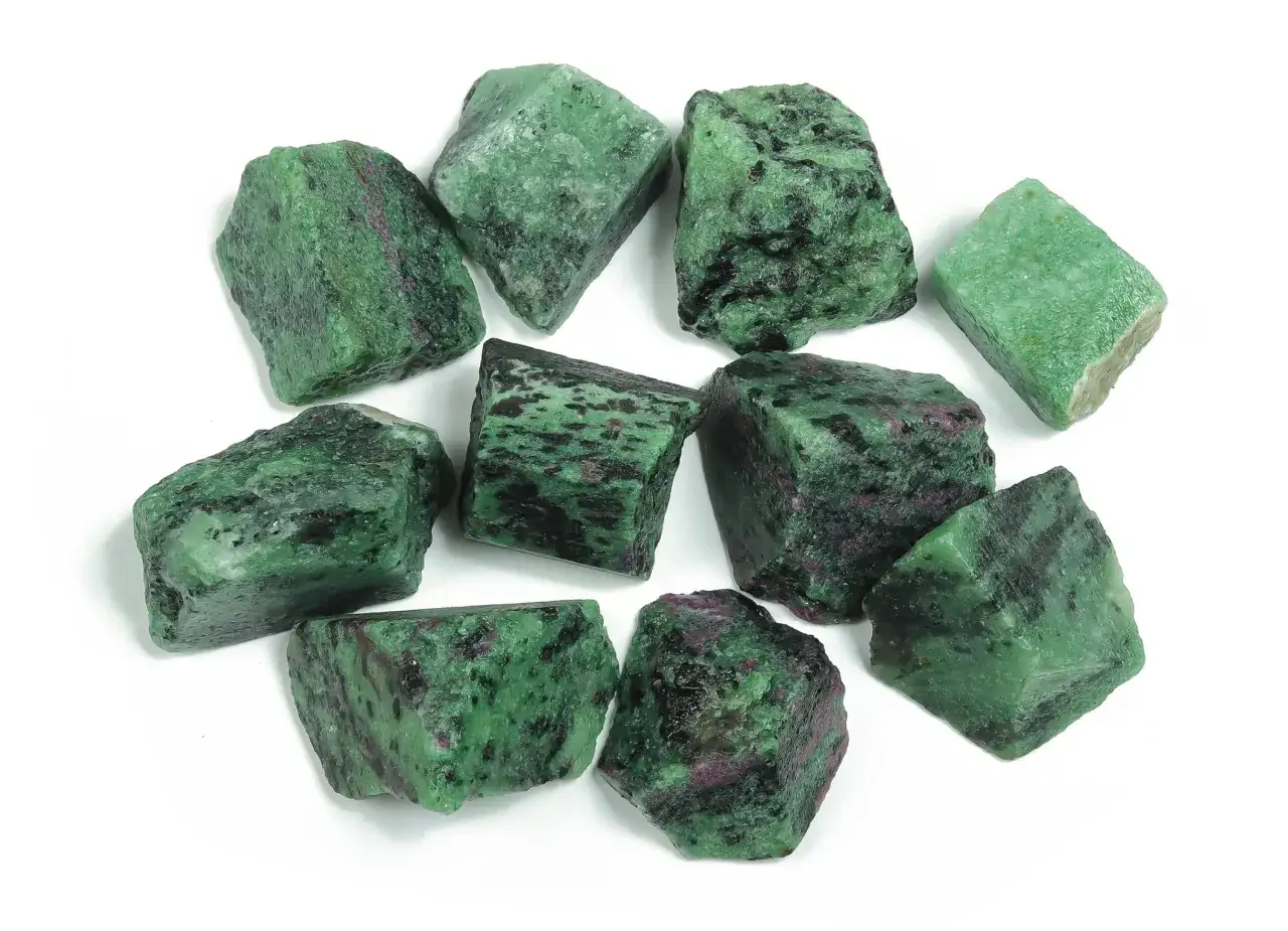
That also explains why the same stone can look dramatically different from one specimen to the next. Some pieces are dominated by green with only a few ruby spots; others look like the opposite, with ruby crystal patches standing out against a darker background. The trick is to choose the version that feels intentional rather than crowded, and that leads naturally to how I judge quality in person.
How to read the colour pattern
When I assess a piece, I do not start with size. I start with the way the colours speak to each other. The best stones have a clear visual rhythm: the red should look like ruby, the green should look clean rather than muddy, and any black or dark green matrix should frame the design instead of swallowing it.
| What I look for | Why it matters | What weakens the piece |
|---|---|---|
| Strong red-green contrast | Gives the stone its identity at a glance | Colours that blur together or look dull in indoor light |
| Visible ruby crystals, not just red tint | Signals a more interesting natural structure | Patchy colour that looks painted on or overly flat |
| Balanced proportions | Keeps the design readable and elegant | Too much dark matrix or too little contrast |
| Clean polish on the surface | Lets the pattern show properly | Scratches, pits, or a waxy finish that hides detail |
Most of the time, I prefer cabochons, carvings, or polished slices for this material. Faceting is uncommon because the stone is more complicated to work with than a single homogeneous gem, and the pattern usually carries more visual power when the cutter preserves the natural layout. A good piece should feel graphic but not overworked. If you have to squint to find the ruby, the stone is not doing its best work.
That visual reading becomes even more useful once you understand how much wear the material can take, because beauty alone is not enough for everyday jewellery.
How durable it is in jewellery
The durability question is where expectations need to stay realistic. Zoisite sits around 6 to 7 on the Mohs scale, while ruby is much harder at 9, but the stone behaves according to the whole composite, not just the ruby crystal fragments. In practical terms, that means the surface can still scratch or chip if the piece is knocked, and the zoisite matrix is the part that tends to limit heavy daily wear.
For that reason, I would rank the jewellery uses like this: pendants and earrings first, brooches and occasional rings next, bracelets last. Pendants and earrings benefit from lower impact and less abrasion. Rings and bracelets take more contact with desks, doors, bags, and other jewellery, so they demand more caution. If you love the look enough to wear it on a ring, choose a protective setting, preferably a bezel, and accept that it is a dress piece rather than a hard-working daily ring.
| Jewellery type | How well it suits the stone | My practical note |
|---|---|---|
| Pendant | Excellent | Low wear, strong visual impact, easy to enjoy |
| Earrings | Very good | Good for polished cabochons or smaller carved stones |
| Brooch | Very good | Classic choice if you want the colour contrast to read clearly |
| Ring | Moderate | Best only in a protective setting and with sensible wear habits |
| Bracelet | Poor to moderate | Too much impact and abrasion for most people’s daily routine |
Cleaning should stay simple. Warm water, a drop of mild soap, and a soft cloth are usually enough for set jewellery, followed by thorough drying. I would avoid ultrasonic or steam cleaning unless you know exactly how the piece was made and whether any fractures, fills, or adhesives are present. With a stone like this, the safest habit is often the least dramatic one.
Once durability is clear, styling becomes much easier, and this is where the stone can look especially good alongside pearls.
How to style it with pearls and other pieces
This is a statement stone, so I like to give it room. It does not need a busy necklace stack or a lot of competing colour. The cleanest looks usually come from pairing it with plain metal, a single neutral gemstone, or pearls that soften the overall effect without stealing attention.
With pearls, the result depends on the mood you want. White pearls make the red and green look crisper and more graphic; cream or ivory pearls make the combination warmer and more vintage; grey pearls pull the look cooler and more modern. The contrast can be beautiful, but it works best when one material leads and the other supports. If both are trying to dominate, the outfit starts to feel visually noisy.
| Pairing | Effect | Best use |
|---|---|---|
| Yellow gold | Warms the green and deepens the red | Vintage-inspired and evening looks |
| Silver or white gold | Sharpened contrast, cooler finish | Modern jewellery and cleaner silhouettes |
| White pearls | Brightens the whole palette | Bridal, formal, or classic styling |
| Cream pearls | Softens the contrast and adds warmth | Everyday elegance with a slightly romantic feel |
If I were styling one piece for a polished outfit, I would keep the rest intentionally quiet: a plain chain, simple earrings, or a single strand of pearls rather than multiple focal points. That restraint lets the stone do what it does best, which is create interest through natural pattern rather than sheer size.
Styling is only half the decision, though. The other half is making sure the piece you buy is honest about what it is and priced in a way that makes sense.
What to check before buying in the UK
In current UK retail, I usually see simple drilled stones or small polished pieces in the low tens of pounds, pendants around £10 to £45, and more elaborate silver-set or carved pieces often landing somewhere around £45 to £200 depending on size, finish, and craftsmanship. Those are broad market observations rather than fixed rules, but they give you a sensible frame of reference when comparing listings.
| Price band | What it often gets you | What to check |
|---|---|---|
| £10-£30 | Small polished pieces, drilled stones, simpler cuts | Colour balance, surface finish, and whether the photos are natural-light friendly |
| £30-£60 | Better pendants or larger cabochons | Setting quality, stone symmetry, and how clearly the ruby stands out |
| £60-£150+ | More substantial silver work, carved pieces, or statement jewellery | Craftsmanship, proportion, and whether the design actually improves the stone |
I would also ask a seller a few direct questions before buying. Is the piece natural, stabilised, dyed, or resin-backed? Is the ruby clearly present as crystal material rather than just colour treatment? Is the setting protective enough for the way you plan to wear it? And does the listing show the stone in daylight as well as in studio lighting? Those questions are not fussy; they are what keep a visually appealing purchase from turning into a disappointment.
For this material, size and composition matter more than carat logic, because you are buying a patterned rock rather than a single, uniform gemstone crystal. That is exactly why one well-cut pendant can feel more luxurious than a larger but muddy-looking specimen.
Where it earns its keep in a jewellery box
My practical view is simple: this is a stone for people who like character. It works best when you want one decisive focal point, especially in a pendant, brooch, or occasional ring. It also sits well in a collection that includes pearls, because the pearl softens the contrast while the ruby-bearing stone adds depth and personality.
If I had to leave you with one rule, it would be this: choose the piece that looks balanced in natural light and then wear it gently. The best examples do not need help from gimmicky settings or overdone styling. They just need space, decent craftsmanship, and the kind of respect you would give any gemstone with a softer matrix and a story worth showing off.